|
The screenshot below, from an interactive map produced by The Trace regarding gun violence in America since 2014, is pretty stunning. The red dots indicate fatal shootings; the yellow dots non-fatal ones. The shootings are disproportionately clustered in certain neighborhoods, including Brownsville, East New York, Bedford-Stuyvesant, Crown Heights, and Flatbush. A closer look shows that specific blocks--in many cases near public housing projects--are more dangerous than others. But what the map doesn't show, at least as of now, is the time of shootings. A good number are surely late at night. 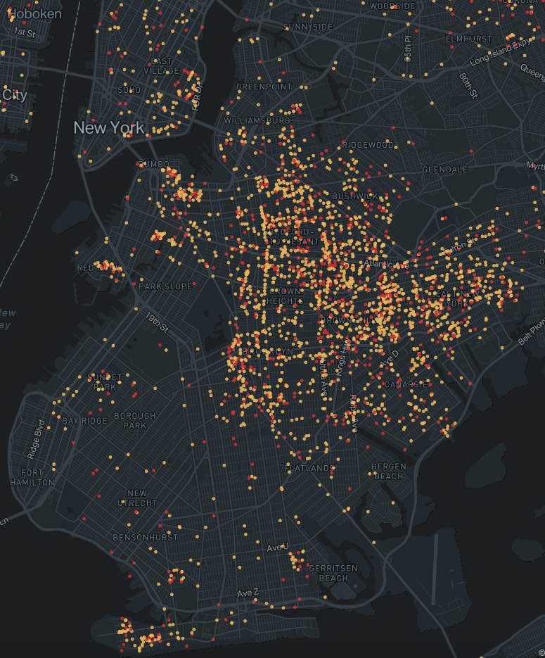
0 Comments
Your comment will be posted after it is approved.
Leave a Reply. |
Touring Brooklyn BlogObservations and ephemera related to my tours and Brooklyn. Comments and questions are welcome--and moderated. Archives
July 2024
Categories
All
|
 RSS Feed