|
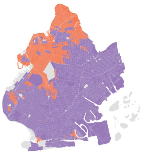
A fascinating map from Gothamist shows the divide in this week's gubernatorial candidate for incumbent Gov. Andrew Cuomo (purple) and challenger-from-the-left Cynthia Nixon (orange).
First, let's put aside that there are sections of Brooklyn that vote Republican, at least in national elections--notably Orthodox Jews and older white ethnics. Those voting in the Democratic primary went for Cuomo. What's notable is that Nixon's support came in better-off, mostly white neighborhoods known for higher incomes and gentrification. Starting in the north, she won all of Greenpoint, the western part of gentrifying Bushwick, and the better-off areas of Williamsburg, excluding the Hasidic section and predominantly Latino blocks. In the "central" part of her support, Nixon won gentrified neighborhoods like DUMBO, Brooklyn Heights, Cobble Hill, Park Slope, Fort Green, and Clinton Hill, plus the western sections of Bedford-Stuyvesant and Crown Heights. The "islands" of purple are mainly clusters of lower-cost housing, including public housing and Mitchell-Lama buildings. Moving south, the gentrification map shows "Greenwood Heights" (actually part of Sunset Park) near the waterfront, some better-off blocks within Sunset Park, and pockets of Bay Ridge. Moving southeast of Park Slope, all of Windsor Terrace is orange, bordering the "elbow" of Prospect Park, while significant chunks of Ditmas Park/Prospect Park South (within Flatbush) are orange. Then there are pieces of Kensington to the west and Prospect-Lefferts Gardens to the east. What about the orange pieces in the south of Brooklyn, to the northeast and northwest of Coney Island? Not sure.
0 Comments
|
Touring Brooklyn BlogObservations and ephemera related to my tours and Brooklyn. Comments and questions are welcome--and moderated. Archives
July 2024
Categories
All
|

 RSS Feed